Overview & Guide
| ECODE | Chapter | Region | Division | Total Giving ↓ | Current | Prior Yr | 2 Yrs Ago | Donors | % Total |
|---|
| RCODE | Region | Division | Total Giving ↓ | Current | Prior Yr | 2 Yrs Ago | Donors | % Total |
|---|
| DCODE | Division | Total Giving ↓ | Current | Prior Yr | 2 Yrs Ago | Donors | % Total |
|---|
| State | Total Giving ↓ | Current | Prior Yr | 2 Yrs Ago | Donors | % Total |
|---|
| FIPS | County | State | Total Giving ↓ | Current | Prior Yr | 2 Yrs Ago | Donors | % Total |
|---|
Generate Custom Report
Select a division, region, or chapter to generate a detailed PDF report
Select a division, region, or chapter and click "Preview Report" to generate your custom report
Giving Capacity Indicators
Wealth screening proxies based on zip code median income data
Capacity Distribution
High Capacity Counties
Market Penetration Analysis
Donors per 100,000 population by county - identify untapped markets
🟢 Market Penetration by Location
Click a bar to drill down • Donors per 100K population
All States Rankings
Wealth Gap Analysis
High-income areas with low donor counts - untapped potential
Wealth vs Donor Scatter
Top Opportunity Counties
Territory Optimization
Chapter boundary analysis and workload balancing recommendations
🔴 Overloaded Chapters
Consider splitting or adding resources
🟢 Underutilized Chapters
Consider merging or expansion opportunities
Optimization Metrics
Recommendations
3D Donor Intelligence
Interactive 3D visualizations powered by ALICE demographic data
3D Market Genome
Each sphere = a county. Position reveals market DNA: wealth stability, donor penetration, and giving intensity.
Drag to rotate. Scroll to zoom. Hover for details.
3D Opportunity Bubble Universe
Explore chapters as floating bubbles in a 3D space where size = giving potential, color = performance, position = demographics
Predictive Capacity Scoreboard
AI-powered scoring combining demographics, wealth indicators, and giving patterns to predict chapter potential
Score Breakdown
Top 10 by Score
Chapter Score Distribution
3D Wealth Terrain Map
Visualize the economic landscape as a 3D surface where peaks represent wealth concentration and valleys show opportunity gaps
Wealth Peaks (Top 5)
Opportunity Valleys (Top 5)
Donor Velocity Flow
Animated particle flow showing donor giving patterns - faster particles = higher engagement, color = gift level
3D Hierarchy Explorer
Interactive 3D sunburst - click to explode levels and explore the organizational structure in stunning detail
Current Level Stats
Children Summary
Performance Ranking
Major Donor Analysis Dashboard
A comprehensive analytical platform for American Red Cross major donor data across 219 chapters
Core Views
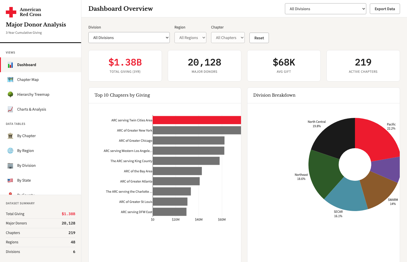
Dashboard
The home view with key metrics at a glance: total giving, donor counts, and average gift size. Includes top-10 chapter rankings and division breakdowns with cascading filters for drill-down.
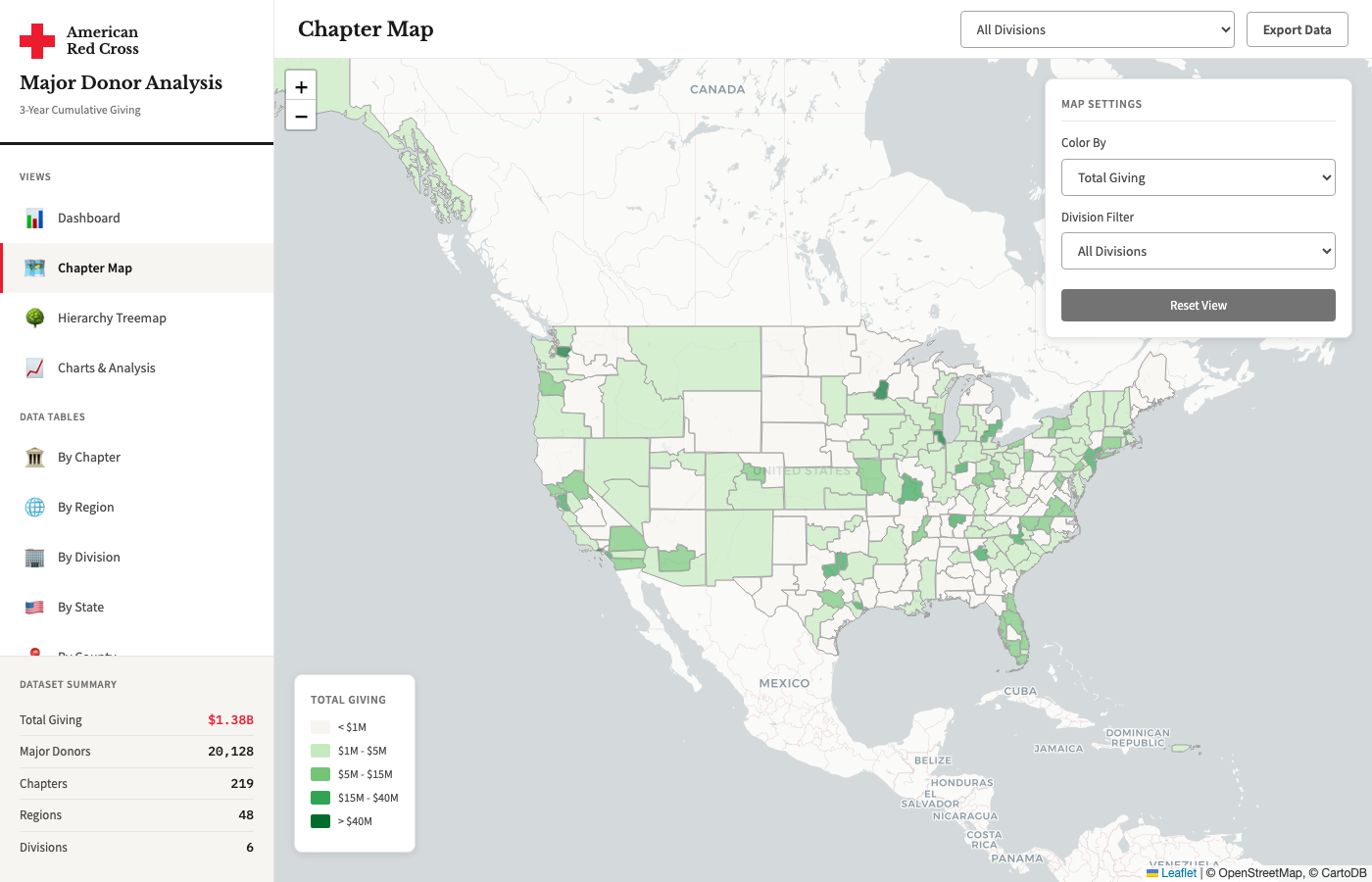
Chapter Map
Interactive choropleth map of all 219 chapter territories. Color-code by total giving, donor count, or average gift. Click any chapter for detailed metrics in a popup.
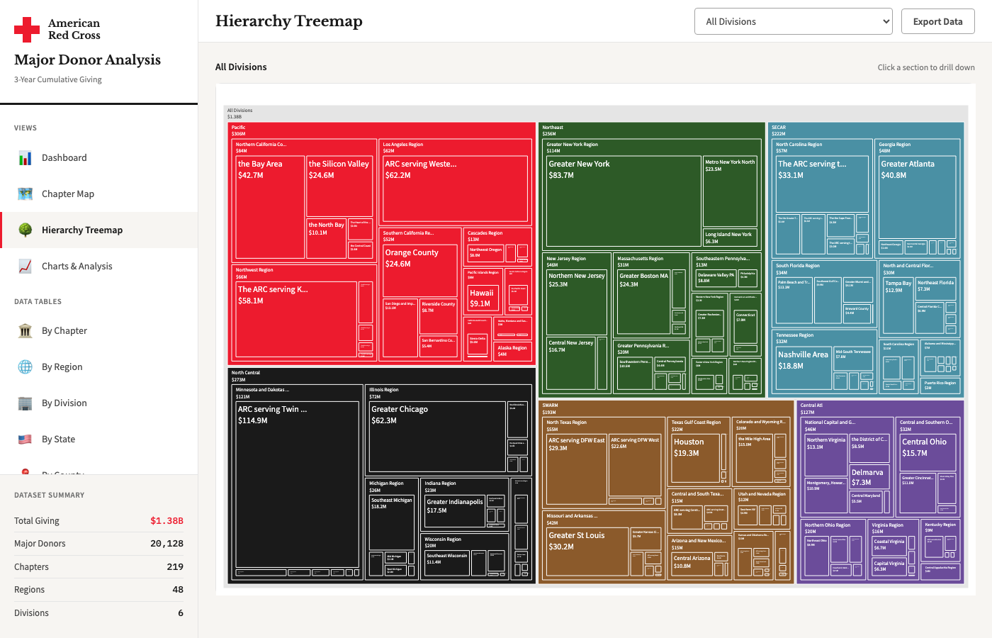
Hierarchy Treemap
Visualize the full organizational hierarchy from Division down to Chapter. Area size represents giving volume, making it easy to spot top performers and compare across organizational levels.
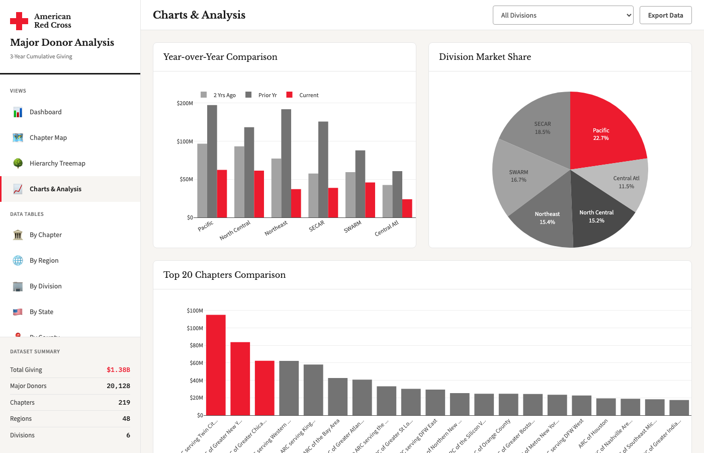
Charts & Analysis
Year-over-year comparison charts, distribution histograms, and scatter plots. Analyze donor concentration, giving trends, and identify outlier chapters across multiple dimensions.
Data Tables
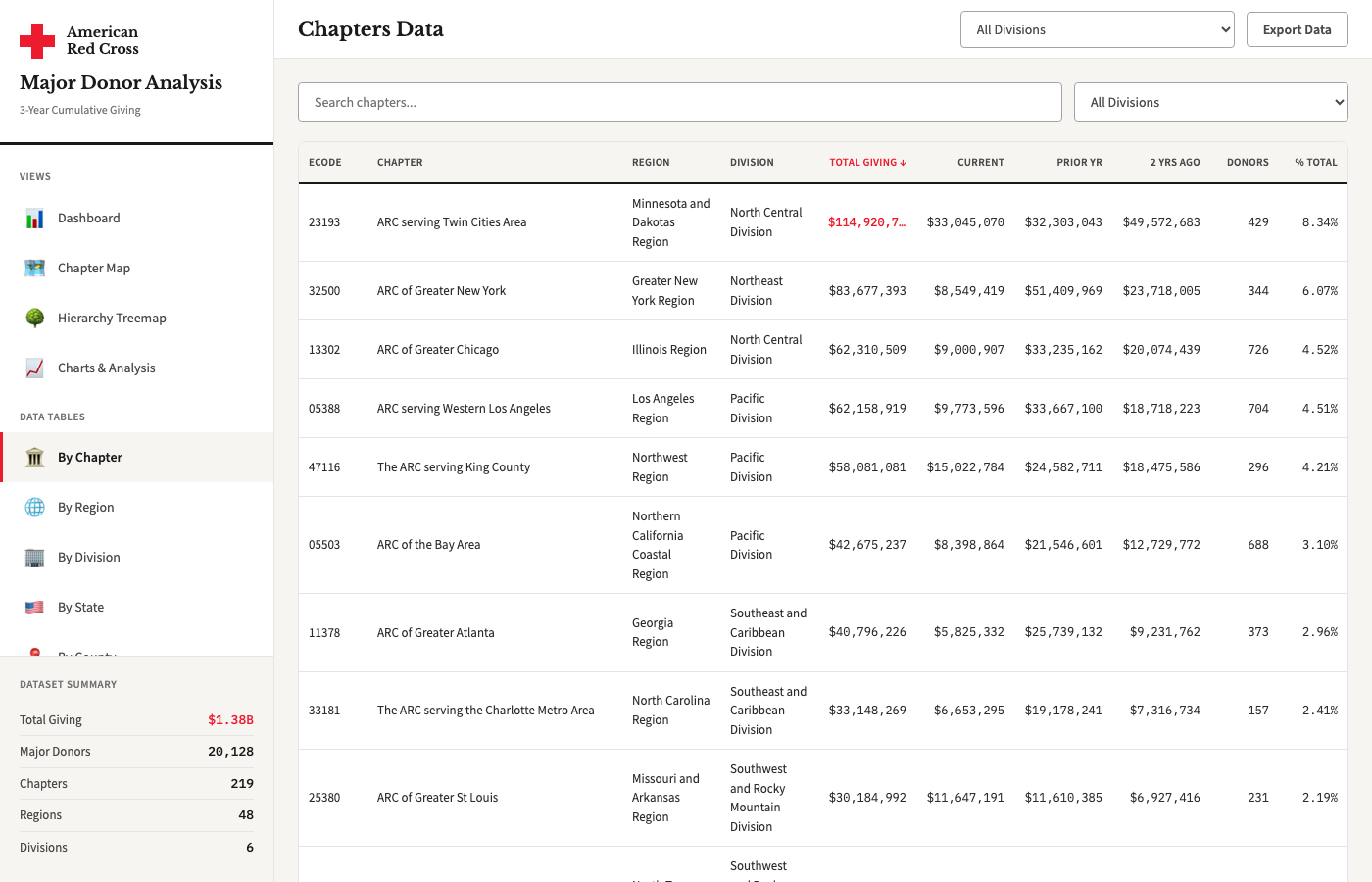
By Chapter
Full sortable table of all 219 chapters with giving totals, donor counts, average gifts, and year-over-year changes. Export to CSV for further analysis.
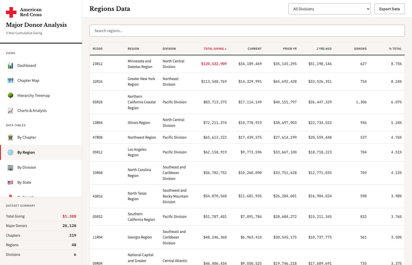
By Region
Aggregated metrics across 48 regions. See how giving is distributed regionally and compare region-level performance at a glance.
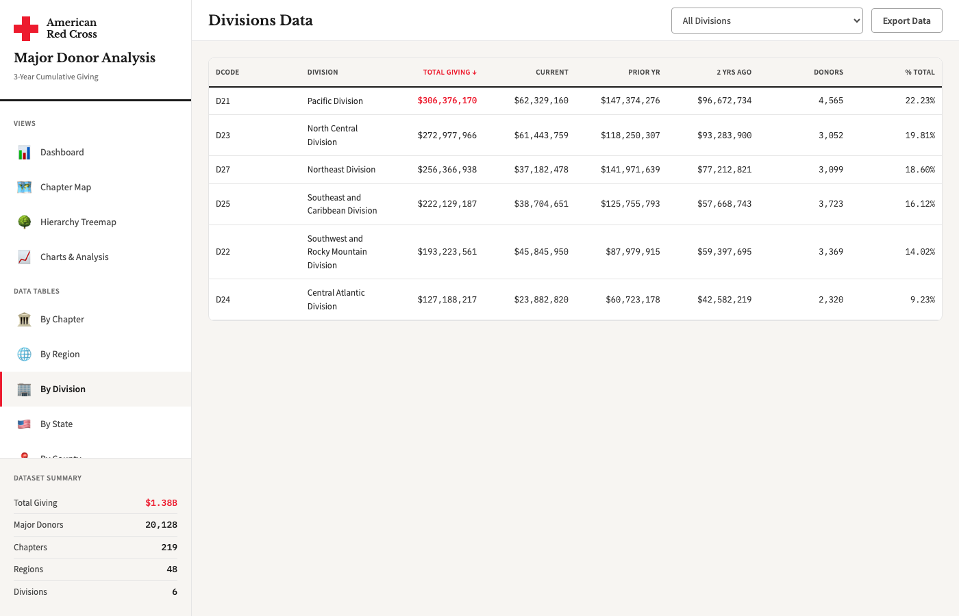
By Division
Top-level view of all 6 divisions with aggregated totals and averages. Useful for executive-level comparison and resource allocation discussions.
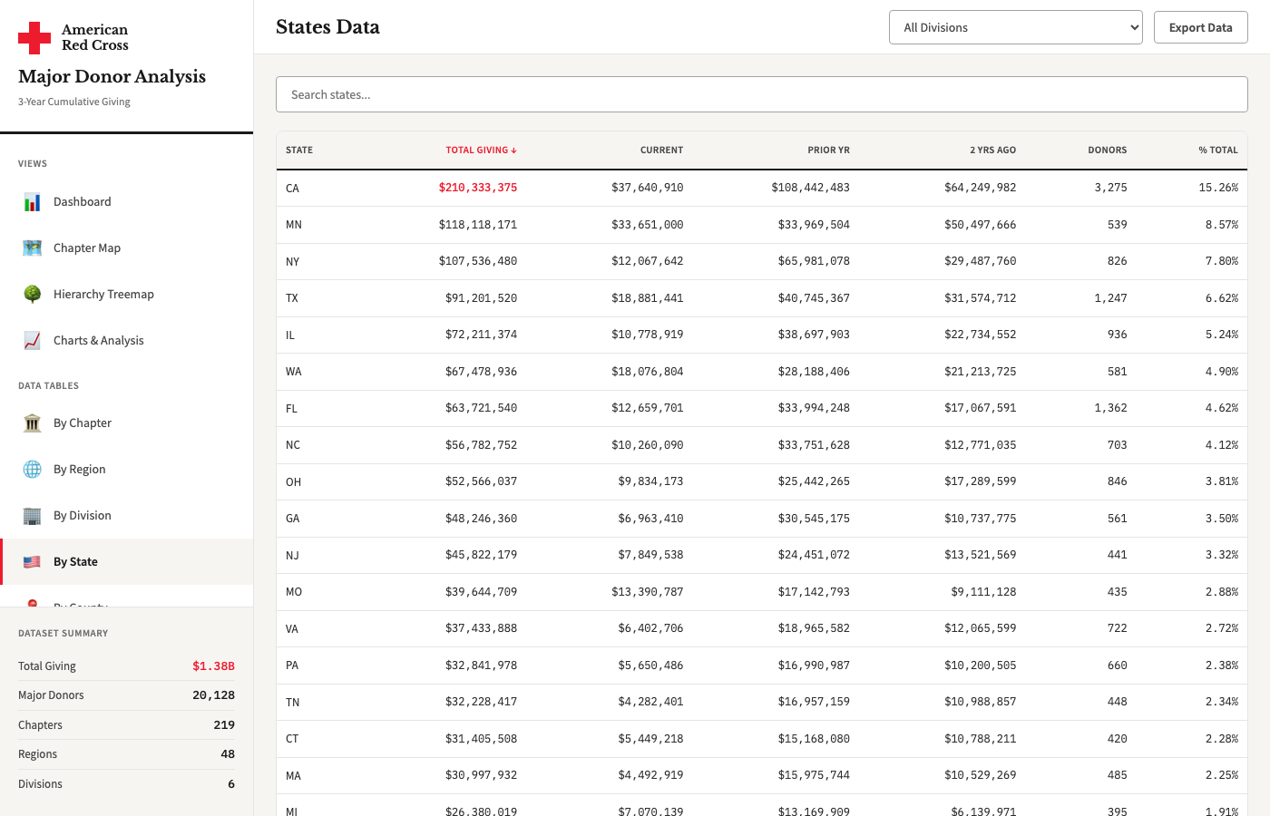
By State
State-level giving aggregation across all 50 states plus territories. Cross-reference with census data and identify geographic giving patterns.
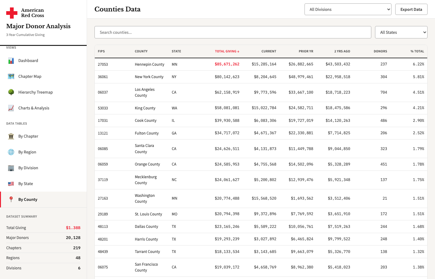
By County
Granular county-level data with population, household income, and ALICE data. Connect donor giving patterns to community-level demographics.
Reports
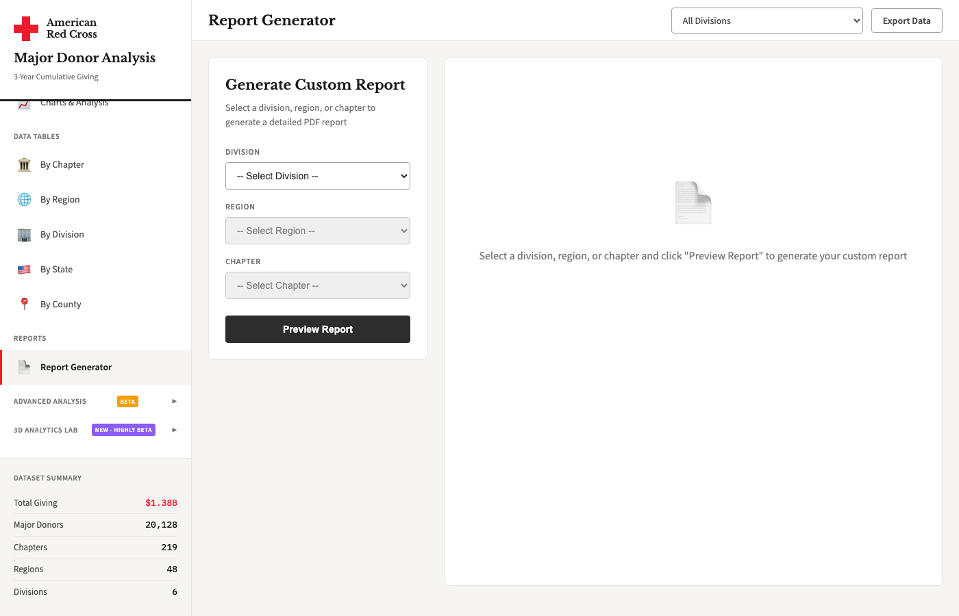
Report Generator
Build custom PDF-ready reports for any chapter, region, or division. Select metrics, add commentary, and generate formatted briefing documents for leadership presentations.
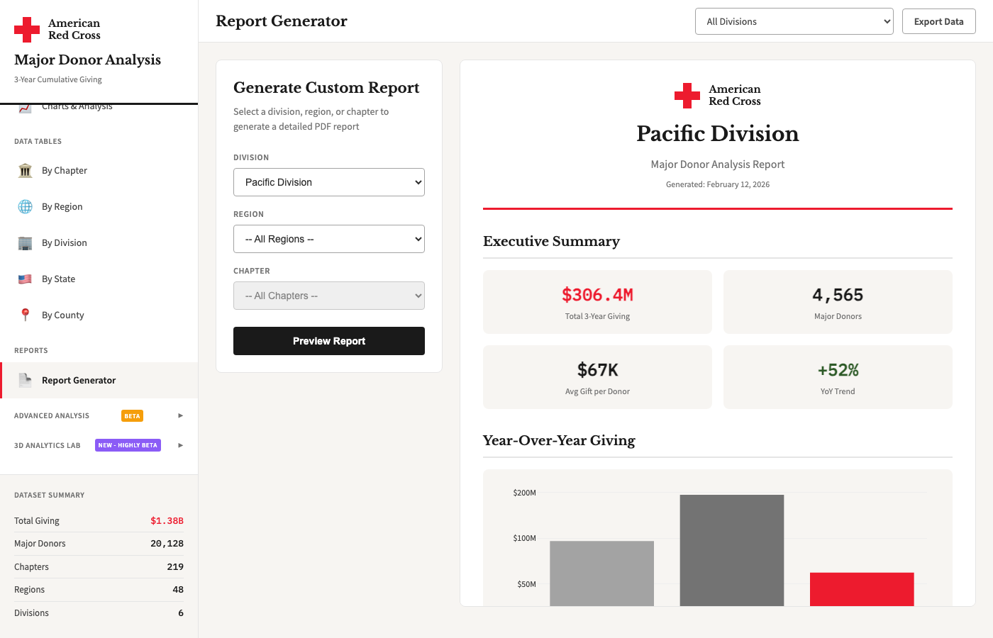
Generated Report Example
A sample of the output from the Report Generator showing formatted metrics, charts, and narrative text ready for leadership review and distribution.
Advanced Analysis BETA
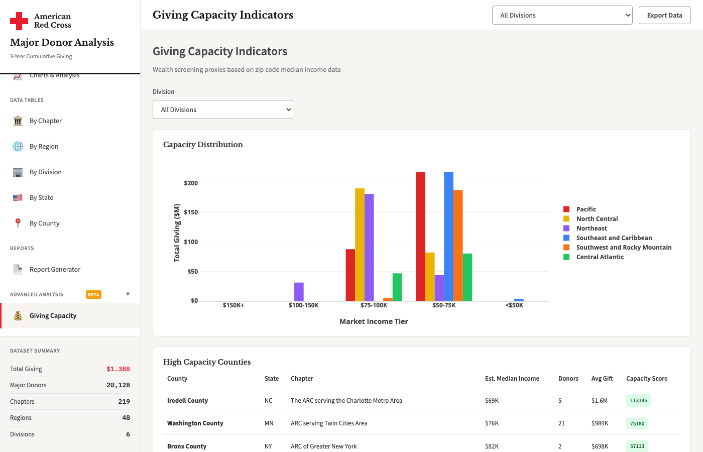
Giving Capacity
Estimates unrealized giving potential by combining household wealth data with current donor penetration rates. Identifies chapters with the largest gap between capacity and actual giving.
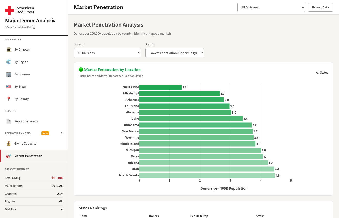
Market Penetration
Analyzes what percentage of high-net-worth households in each territory are active donors. Highlights under-penetrated markets where targeted outreach could yield the highest returns.
3D Analytics Lab HIGHLY EXPERIMENTAL
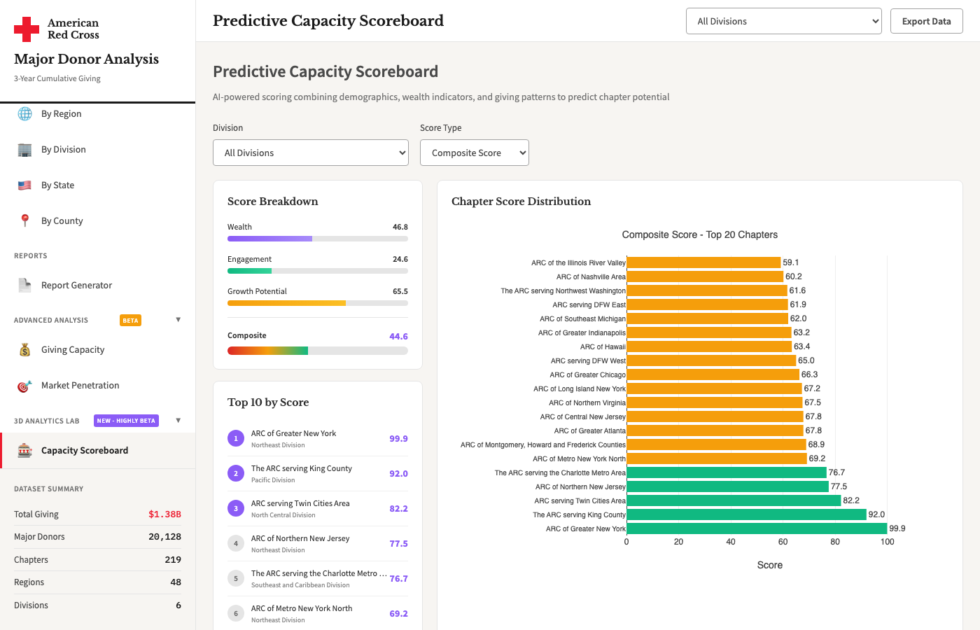
Capacity Scoreboard
Predictive scoring model that ranks chapters by fundraising potential using a composite of demographic, wealth, and historical giving signals. Interactive 3D visualization.
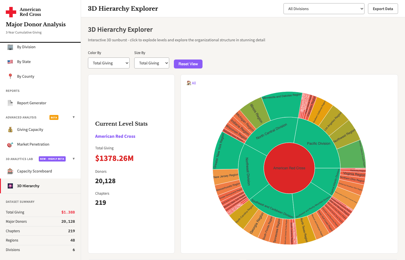
3D Hierarchy Explorer
Interactive 3D sunburst visualization of the full organizational structure. Click to explode levels and explore Division, Region, and Chapter relationships in a dynamic view.